Project 01 · Hailer · 2026
Redesigning navigation for apps and multiworkspace use

Context
Hailer is a business and enterprise management platform built on linked data and contextual discussions. Users can work with the underlying data through Hailer’s core views, including tables, Kanban boards, calendars and discussion-based views.
When those standard views are not enough, users can build custom apps with Hailer’s SDK, with or without AI. These apps provide more tailored ways to present and interact with the same data, for example through dashboards, customer portals, web shops or booking calendars. Apps can also be made public, allowing organizations to expose selected data and services outside Hailer.
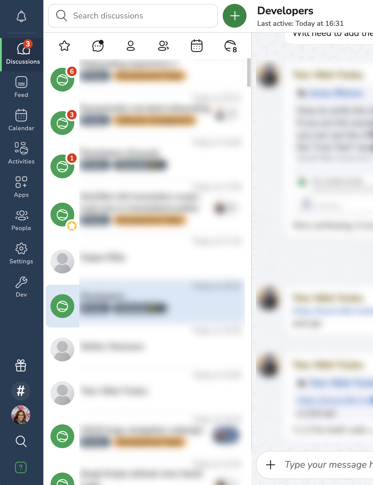
As workspace apps became more important to how customers used the product, the existing navigation no longer reflected the tools users actually relied on. Some users worked mainly in one or two workspace apps and rarely used the core apps, while others worked across several apps and workspaces. Moving from an app in one workspace to an app in another required four clicks.
The existing structure also caused problems for new users. A user could land directly in their assigned default workspace app, but the app was not shown as selected in the navigation. The navigation instead emphasized unrelated core apps, and users could struggle to find their way back after navigating elsewhere.
These issues came from customer feedback as well as our own daily use of Hailer, which made the friction easy to verify in real workflows.
The redesign needed to reduce this friction while making navigation work across multiple workspaces.
My role
- Owned the UX and UI design
- Defined the new navigation and app-management model
- Implemented the entire frontend solution
- Designed and developed the app icon generator across frontend and backend
- Worked through permissions, legacy product structures and existing-user onboarding for the new personalised navigation
- I refined the requirements with the Product Owner, discussed the solution with senior developers, and iterated on it during six weeks of internal testing in a staging environment
Problem & constraints
User experience
- The navigation prioritised Hailer’s core apps, even though many users mainly worked in workspace apps
- New users could land in their assigned workspace app while the navigation showed unrelated core apps and users tend to get sidetracked to there and not find their way back to their workspace app
- Moving between apps across workspaces required four clicks
Product and system
- Different users needed different combinations of apps and workspaces
- Navigation needed to support the product’s move toward multiworkspace
- Existing custom roles had to keep working
Supporting issues
- Launching and managing apps happened in separate locations
- Existing app icons were inconsistent and worked poorly in dark mode
- Existing users needed help with moved and renamed features
What I built
Personalized navigation
One favourite model
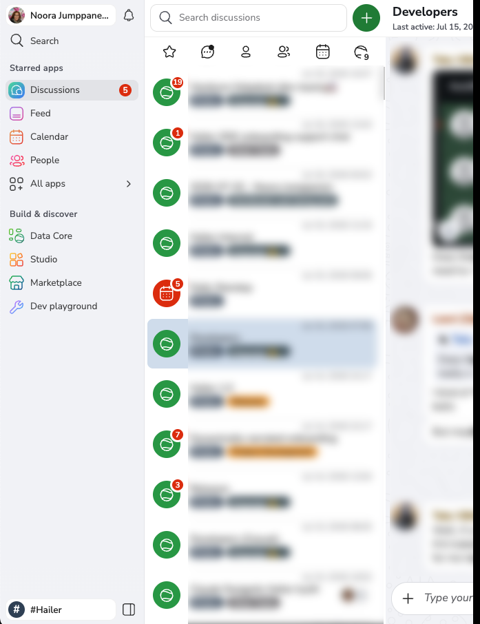
I replaced the navigation based on a fixed set of core apps with one based on the user’s favourite apps. Users can favourite both Hailer apps and workspace apps, creating a navigation that reflects the tools they use most frequently.
One of the main design challenges was deciding how users would both add apps to the navigation and mark important apps for filtering in All apps. These could have been separate features, but that would have added unnecessary complexity. I used a single star action for both: starring an app adds it to the navigation and includes it in the favourites filter. A star also matched Hailer’s existing convention for personal favourites. A pin would have conflicted with Feed, where pinning affects everyone.
Keeping users oriented
The navigation displays up to ten favourite apps to keep it readable. Users can still favourite more apps across their workspaces and find them using the favourites filter in All apps.
The currently open app is also shown in the navigation, even when the user has not marked it as a favourite. This avoids a disconnect where the navigation does not reflect the location of the content being viewed.
The navigation also preserves “ghost apps”: apps that were previously starred but are no longer available because the user lost access or the app was removed. Instead of silently disappearing, they remain visible and explain what happened when opened.
Starting with one default app
For both new and existing users, I chose Discussions as the only favourite app shown by default. New users receive welcome messages there, so it needed to remain visible.
Using the same default for everyone also avoided a technically complex setup where new and existing users would require different defaults based on permissions and previous navigation states.
Showing Discussions as already favourited also demonstrates how the new model works, supported by the helper text in All apps.
Different users and screen sizes
I designed an expanded and collapsed desktop navigation, as well as a separate mobile solution, so the same personalised app model works across screen sizes.
The navigation adapts to each user’s permissions. Available apps, actions and section headings are shown only when relevant. Existing custom roles controlling access to individual Hailer apps also had to remain supported.
Designed for multiworkspace
I designed the navigation to work independently of how users select and switch between workspaces. This keeps the structure adaptable to different workspace configurations without requiring another major navigation redesign.
Modernising the visual language
The old sidebar was designed for only a few apps and no longer had enough space for Hailer’s growing app ecosystem. Widening it also made its heavy dark backgrounds feel increasingly dated and disconnected from the rest of the product. I redesigned the layout and visual style to support more apps while still fitting naturally alongside Hailer’s partially legacy UI.
All apps panel
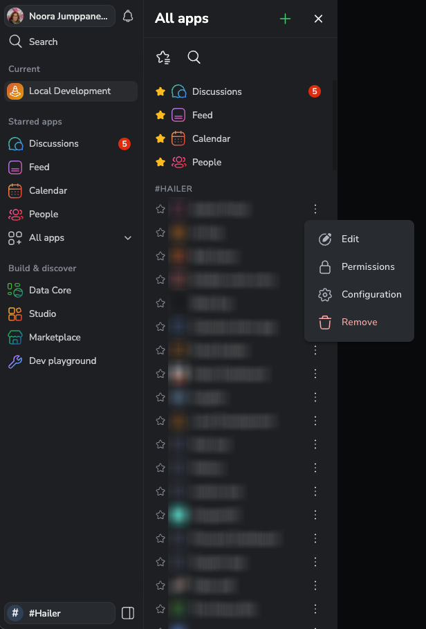
I created All apps as the central place where users can find, launch and favourite all Hailer and workspace apps available to them.
I chose a panel instead of a separate page because All apps is part of navigation. Users can open the panel, choose an app and continue working without first navigating to a separate Apps page.
Apps are grouped by workspace and can be searched or filtered by favourites, giving users access to a larger collection without overloading the navigation.
I also moved app management from a separate Apps Management page into All apps. Depending on their permissions, users can create apps, edit details, manage permissions and configurations, and remove apps from the same place where they are found and launched.
App icon system and generator
I designed and implemented a new icon system for Hailer and workspace apps, including an icon generator for workspace apps.
Previously, users were expected to upload their own image. Most skipped this step and kept the default Hailer logo, which gave apps little identity, made the app collection visually repetitive and did not work properly in dark mode.
The new generator provides a curated selection of icons and gradient colours. Users can choose a combination themselves or let the system generate one automatically.
This removed the option to upload any image, but we prioritised an easier process and a consistent visual style because most users had not used the previous flexibility.
Existing-user onboarding
I added a one-time onboarding card for existing users, highlighting the three changes most likely to cause confusion: the new All apps panel, the renaming of Activities to Data Core, and the new location of Workspace settings. I also added helper text explaining that favouriting apps adds them to the navigation.
Accessibility
Accessibility was built into the full solution, including the navigation, All apps panel and icon generator. This included keyboard use, focus states, contrast, clear current and selected states, and accessible labels for interactive controls.
Impact
- Reduced switching between apps from up to four clicks to one click for favourite apps, or two clicks through All apps, regardless of workspace
- Gave users a personalised navigation based on the apps they actually use
- Kept the current app visible in the navigation, providing a clear way back even when it was not favourited
- Centralised app discovery, launching, favouriting and management in All apps
- Improved onboarding by making the navigation match the app a user had been invited to use
- Established a navigation structure that supports Hailer’s move toward multiworkspace
- Created a consistent and recognisable icon system across Hailer core apps and workspace apps
Tools & technology
- Design and research: Pen and paper, Mobbin
- Development: Angular, TypeScript, Node.js, Playwright
- AI support: Claude Code, Claude Design, ChatGPT
- Documentation and workflow: Hailer, Obsidian
Project 02 · Hailer · 2026
Designing a stackable drawer interface for complex workflows
Context
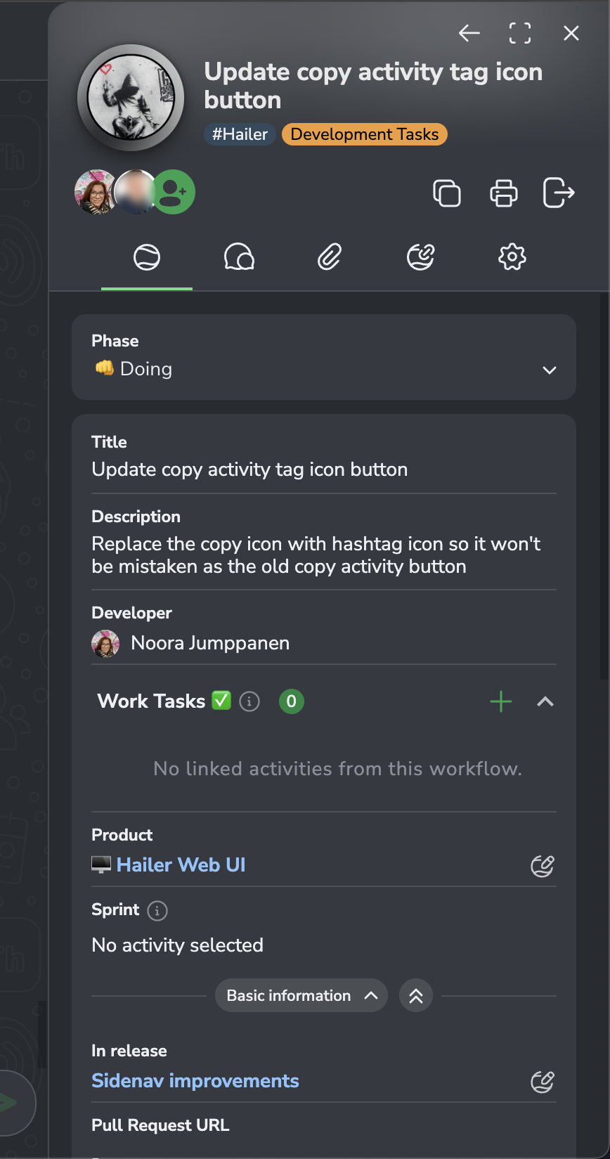
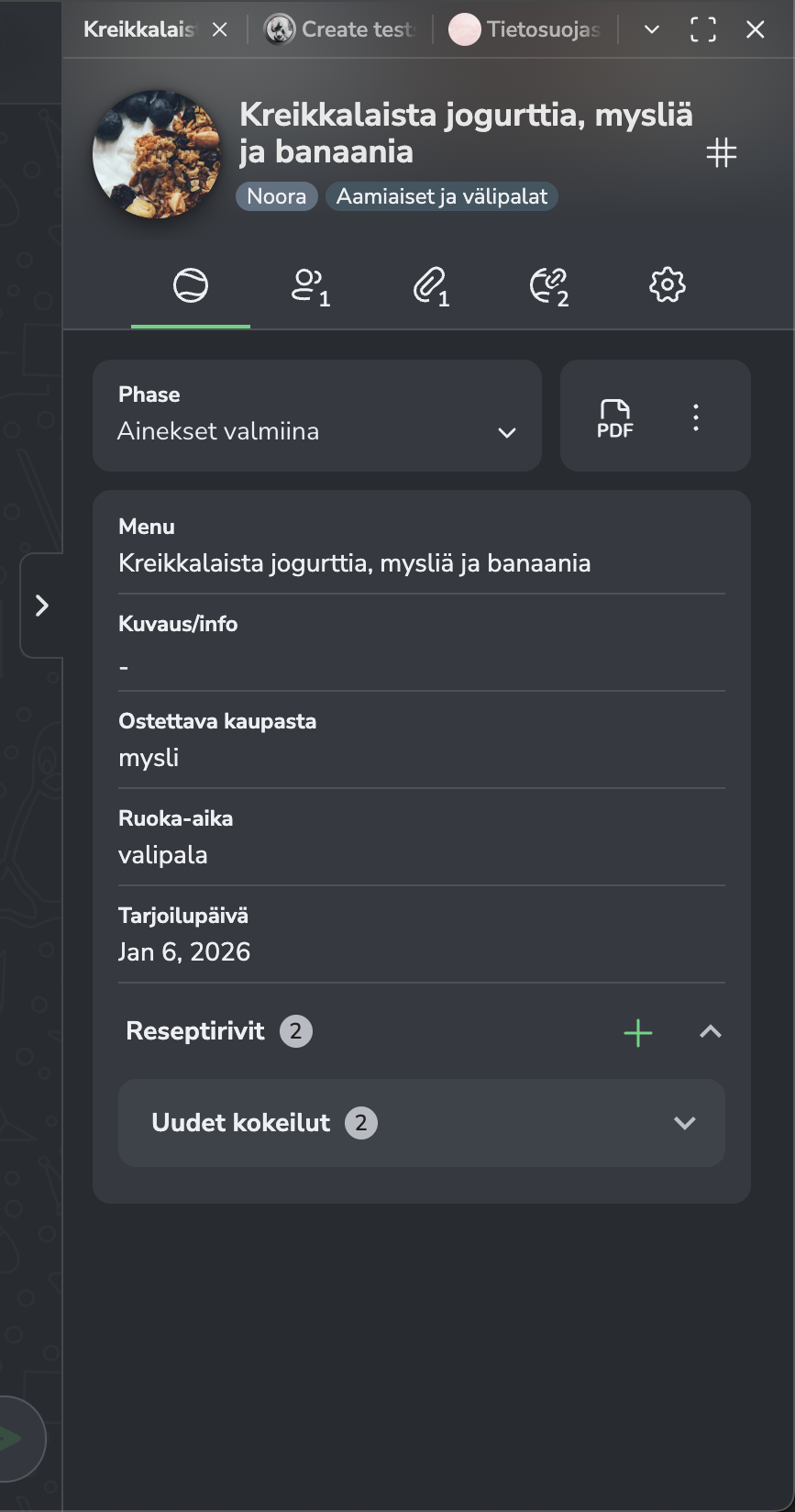
Hailer is a business and enterprise management platform built on linked data and contextual discussions. The product relied heavily on a drawer-based UI for handling activities, but the existing solution only allowed one drawer to be open at a time. This limited workflows and made it difficult for users to move between items or keep track of what they had previously opened.
A redesign was needed to support more flexible workflows while keeping the interface clear and manageable. This required defining a new interaction pattern beyond the existing design system.
My role
- Took over the UX, UI and frontend refinement of an early functional drawer stack
- Worked closely with the full-stack developer who owned the underlying stack functionality, persistence and cross-view behaviour
- Implemented the user-facing interface and interaction details in the frontend
Problem & constraints
- Needed to support working across multiple items without overwhelming the user
- No existing design pattern to directly follow
- Had to keep the UI clear even as complexity increased
- Required to work across desktop and mobile layouts
- Needed to integrate with existing product structure and workflows
What I built
- The complete visual and interaction design for the drawer stack
- Tab navigation, active states and visual hierarchy for switching between drawers
- Transitions and animations that made changes in the stack understandable
- Overflow handling and controls for larger stacks
- Responsive layouts for desktop and mobile
- Frontend behaviour for opening the drawer in the appropriate view and keeping the collapsed stack easy to access
Impact
- Made the drawer stack easier to understand and operate
- Gave users clearer feedback when opening, switching and closing drawers
- Reduced the risk of losing orientation in complex workflows
- Made the interaction consistent across desktop and mobile
- Brought the early functional solution to a production-ready level
Project 03 · Hailer · 2025
Scaling a design system across platforms (Angular + React)
Context
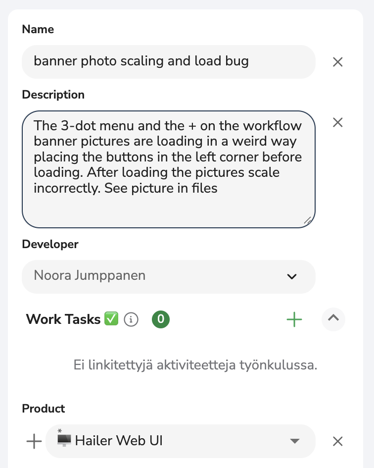
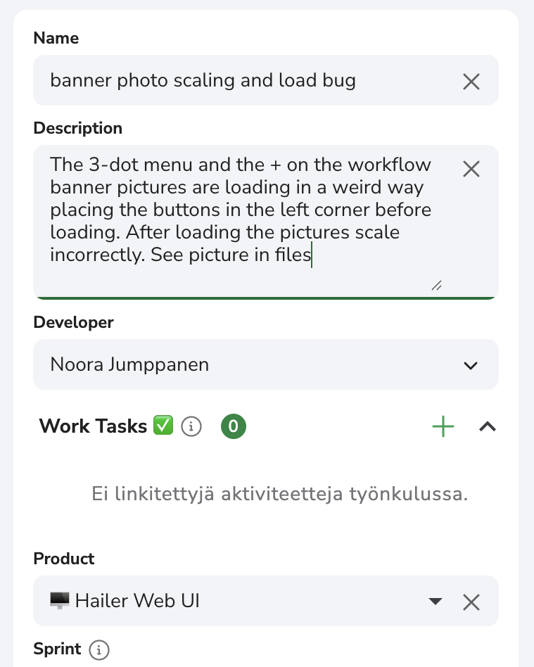
Hailer is a business and enterprise management platform built on linked data and contextual discussions. The product had inconsistent UI patterns and fragmented styling across components, which slowed down development and created an uneven user experience. The frontend was based on an older Angular version and lacked a scalable theming approach.
At the same time, the platform introduced support for building apps with React, but there were no shared styles or guidelines for these extensions. This led to inconsistent UI quality, as app developers needed a simple way to create interfaces that matched the core product.
My role
- Owned the design system development and theming approach
- Led the UI layer modernization as part of the Angular 14 to 19 upgrade
- Took ownership of accessibility across UI components
- Defined UI, UX, and accessibility standards for the team
- Enabled more consistent frontend implementation across Angular and React-based applications
What I did
Design system
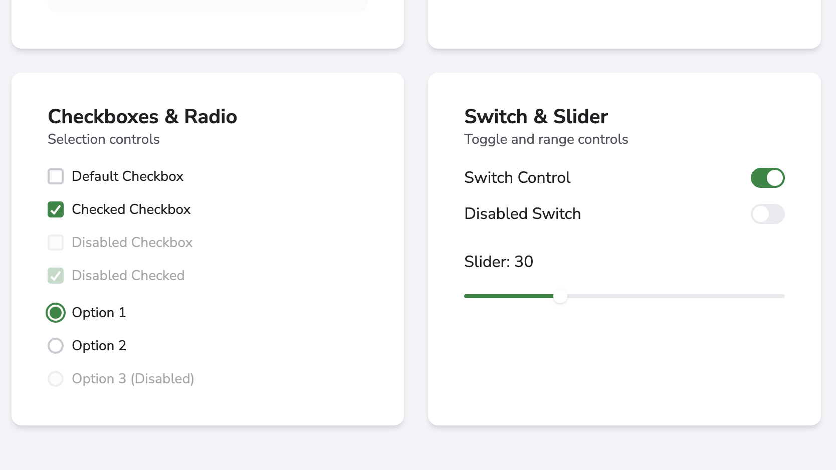
- Rebuilt the theming system for Angular Material and defined a theming approach for a React application, including selecting and adopting Chakra UI
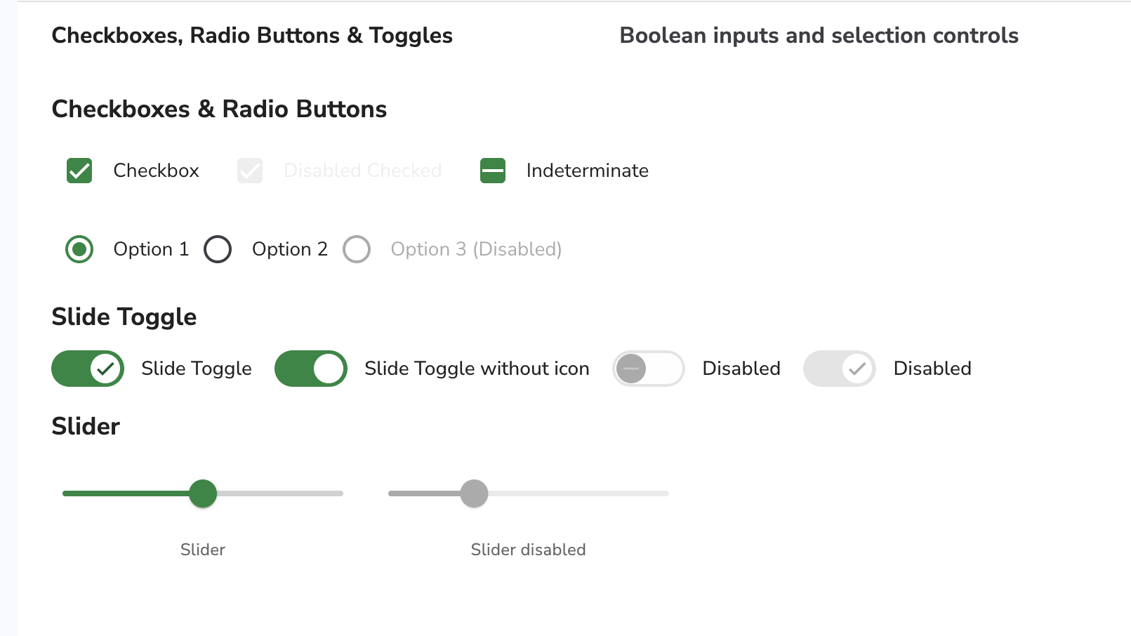
- Defined consistent styles for UI components, including missing Material components
- Redefined button hierarchy by replacing multiple competing filled styles with a clearer system using filled and outlined variants, improving visual clarity and consistency
- Created reusable patterns to unify the UI across the product
Frontend & refactoring
- Replaced legacy components with updated implementations
- Removed large amounts of redundant SCSS and simplified the styling architecture
Accessibility
- Took ownership of accessibility across UI components
- Ensured accessibility standards were consistently applied during the frontend modernization
Cross-platform
- Applied design system principles across both Angular (Material) and React (Chakra UI)
- Aligned visual language and interaction patterns across platforms
Developer experience
- Defined standards for UI, UX, and accessibility
- Created documentation and clear guidelines for using the design system
- Enabled developers (and AI-assisted workflows) to produce consistent UI without relying on manual styling
- Shifted UI implementation from designer-driven to developer-enabled workflows
Decisions & constraints
- Replaced custom-built button components with Angular Material buttons styled to match the design system, as they better support common use cases and align with the existing component model
- Accepted minor differences between Angular (Material) and React (Chakra UI) implementations instead of forcing full parity
- Focused on incremental improvements rather than attempting a full rewrite of the existing UI
Impact
- Reduced the need for ad-hoc styling and improved consistency across new features
- Enabled developers to build UI more independently using shared patterns and guidelines
- Improved overall UI consistency across both the core product and platform extensions
- Simplified the frontend codebase by removing redundant styles and legacy components
- Created a more scalable foundation for future development
- Freed up time to focus on design system development and more complex design problems